Brand Refinement
Muni
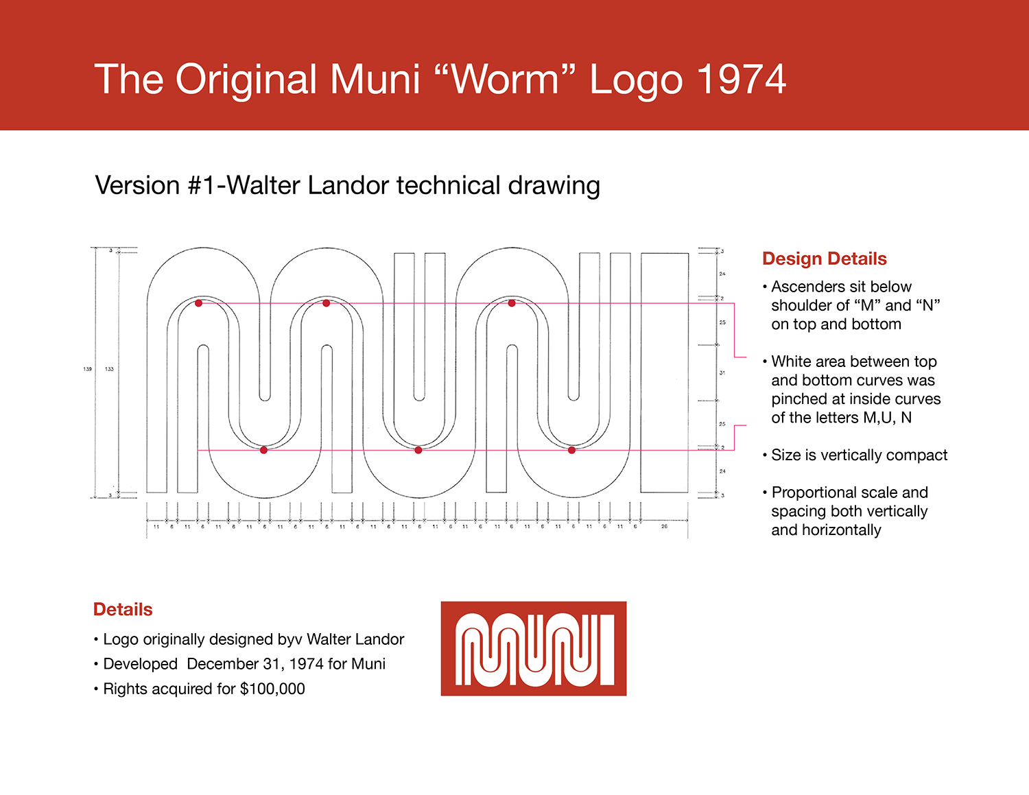
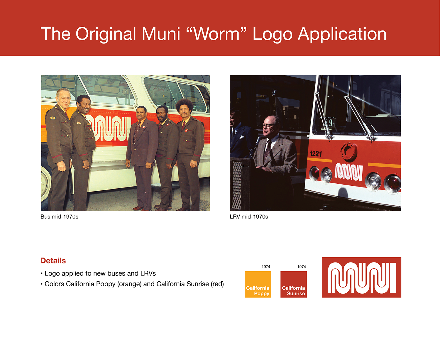
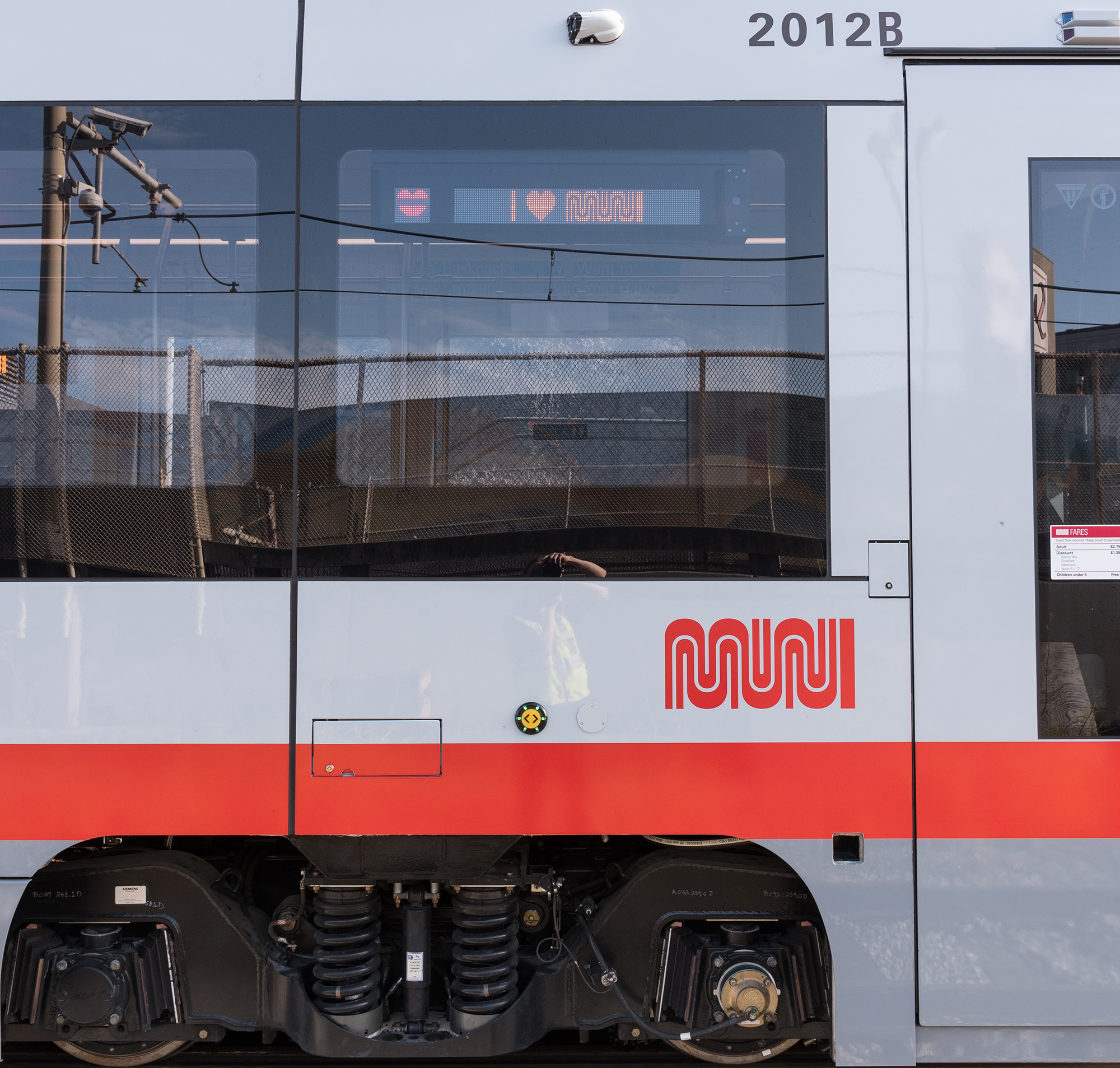
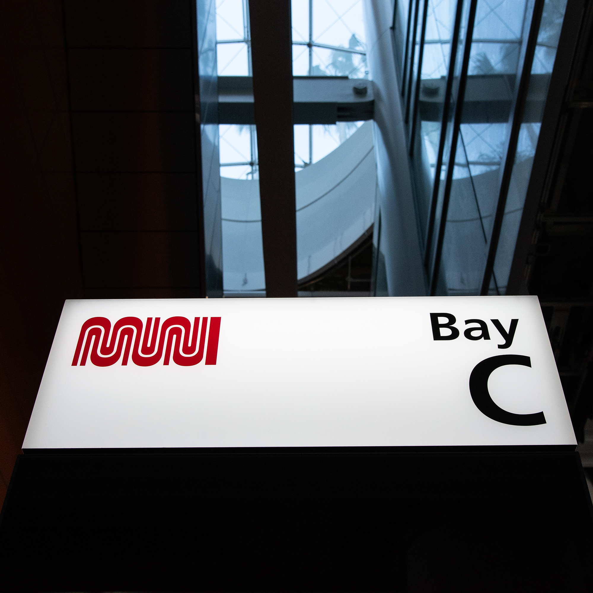
Muni‘s iconic “worm” logo was designed by Walter Landor in the 1970s. It’s a love-it-or-hate-it kind of logo, but it will never be mistaken for the municipal railway logo of any other city than San Francisco.
I grew up in San Francisco and remember riding the 22 Fillmore and seeing the logo as a child on the way to school. It didn't take me long to figure out that the logo spelled out the word MUNI.
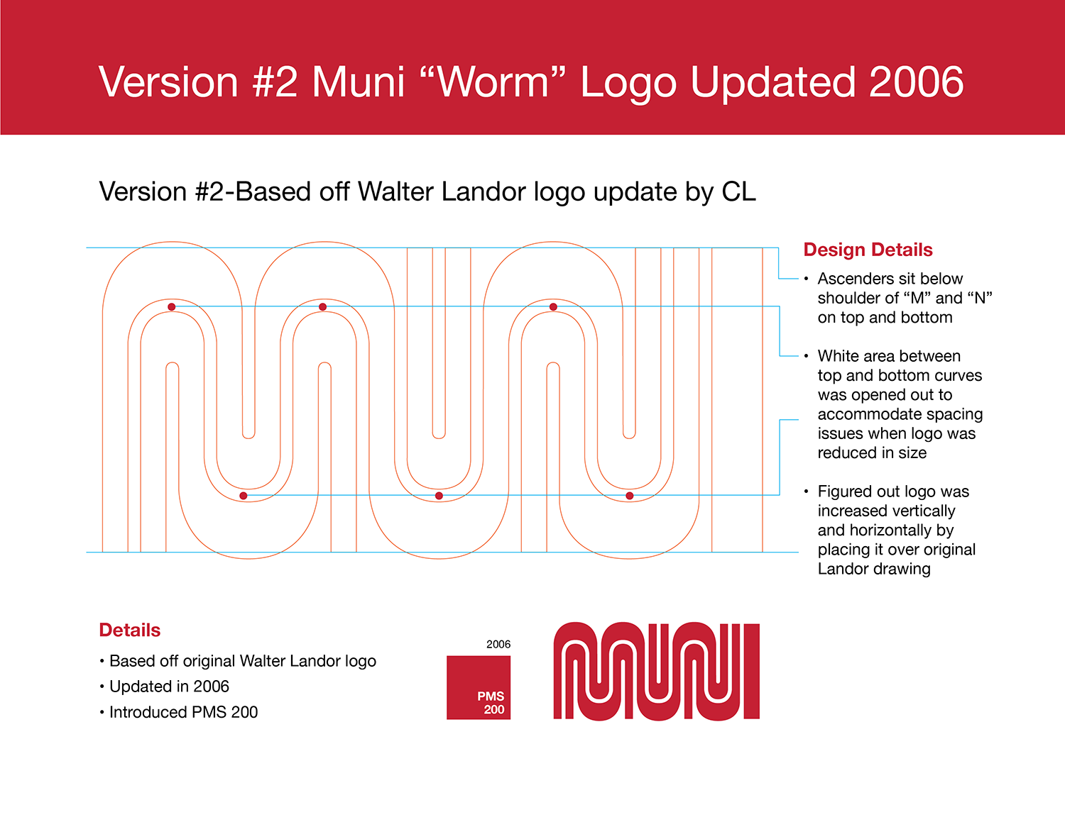
In 2015, I was lucky enough to work on updating and develop the brand standards for the Muni "worm".
Challenges were how to update the mark in order to address multiple versions of the logo, color, update MUNI brand guidelines, update MUNI decal standards, assess impact, communicate changes to internal user/stakeholders and maintaining consistency.
I grew up in San Francisco and remember riding the 22 Fillmore and seeing the logo as a child on the way to school. It didn't take me long to figure out that the logo spelled out the word MUNI.
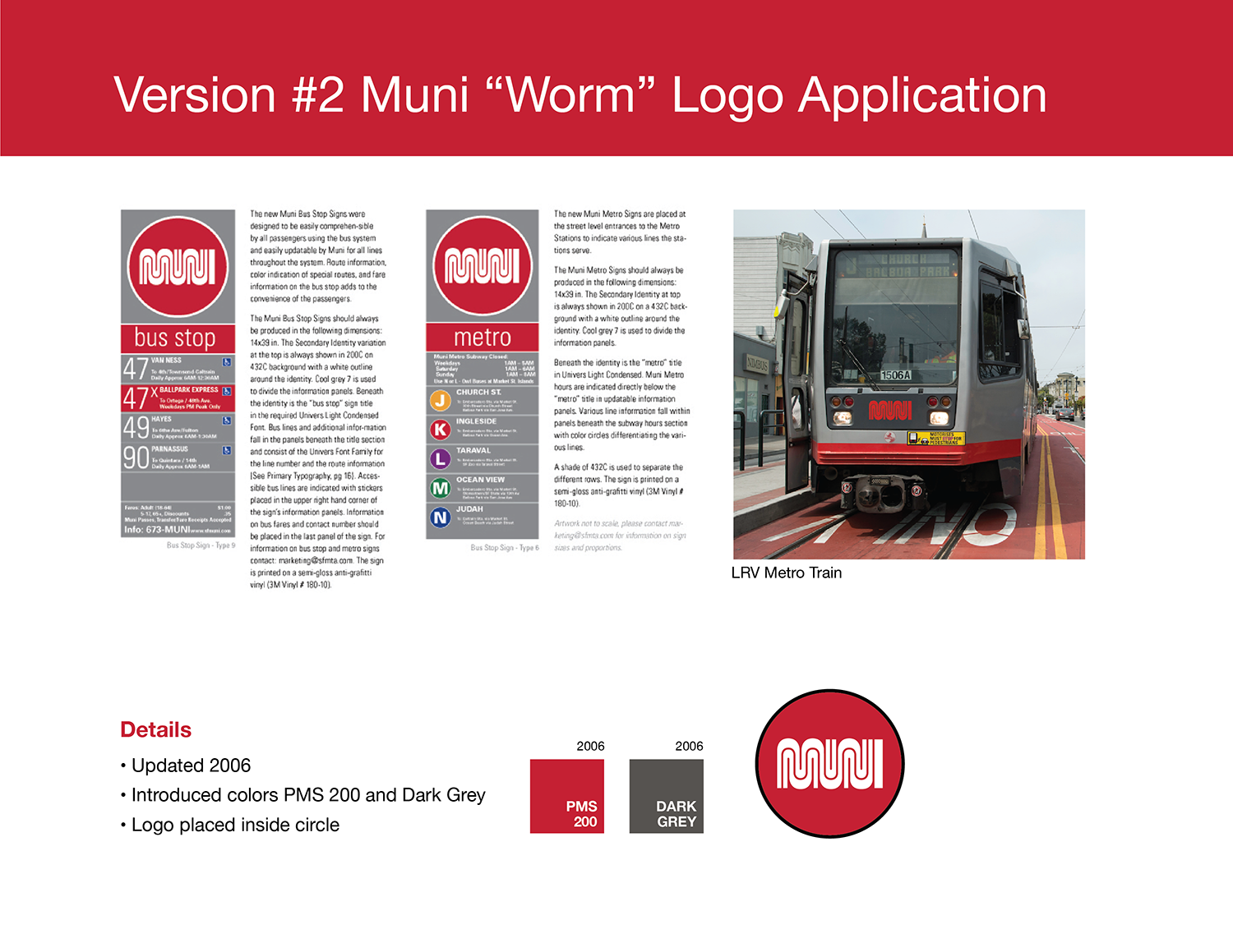
In 2015, I was lucky enough to work on updating and develop the brand standards for the Muni "worm".
Challenges were how to update the mark in order to address multiple versions of the logo, color, update MUNI brand guidelines, update MUNI decal standards, assess impact, communicate changes to internal user/stakeholders and maintaining consistency.
CLIENT
San Francisco Municipal Transportation Agency
ROLE
Art Direction and Graphic Design
YEAR
2015

